TL;DR
- ApexCharts is an open-source JS library with 30+ chart types – bar, line, area, pie, and more
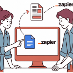
- APITemplate.io lets you embed ApexCharts into HTML templates and generate PDFs via API
- Charts render as vector format, so they stay crisp at any size
- You can pass dynamic data using Jinja2 variables and make a single POST request to generate the PDF
- A working Python example is included – swap in your API key and template ID and you’re good to go
When it comes to creating visually stunning charts for your PDF documents, ApexCharts and APITemplate. are two powerful tools that can help you achieve professional-looking results.
In this article, we will guide you through the process of generating PDF documents with stunning charts using ApexCharts.
1. What is ApexCharts?
ApexCharts is an open-source library that is easy to use and provides excellent support for developers. It was built with the latest web technologies, making it highly performant and responsive.
The library supports over 30 chart types, including line charts, area charts, bar charts, column charts, pie charts, and more. ApexCharts is compatible with all modern browsers and can be integrated easily with other web technologies.
In many modern workflows, generated documents are also combined with visual assets like product images for catalogs, invoices, and digital brochures. Businesses often explore resources such as best apps for product photography to ensure that the images used inside PDF documents remain high-quality and consistent across automated outputs.
The benefits of using ApexCharts
One of the significant benefits of using ApexCharts is its ability to handle large datasets effortlessly. The library can handle thousands of data points with ease, making it ideal for creating real-time dashboards and data-driven applications.
Additionally, ApexCharts provides a range of customization options that allow developers to create bespoke charts that match their branding or user interface requirements.
Key Features of ApexCharts
ApexCharts is highly interactive, providing users with hover effects, tooltips, zooming, and panning. It also includes a range of animation options that can be used to create stunning transitions and effects. Developers can use ApexCharts to create responsive charts that adjust automatically to fit different screen sizes and resolutions.
Below are some of the key features of ApexCharts.
- Wide Range of Chart Types: ApexCharts supports over 30 chart types, including line charts, area charts, bar charts, column charts, pie charts, and more. This allows developers to choose the best chart type to represent their data effectively.
- Highly Customizable: ApexCharts provides a range of customization options, including colors, fonts, backgrounds, annotations, and markers, legends, and labels. Developers can also customize the axis and grid lines to match their requirements.
- Interactive: ApexCharts is highly interactive, providing users with hover effects, tooltips, zooming, and panning. This allows users to explore the data and gain insights quickly.
- Responsive: ApexCharts can be used to create responsive charts that adjust automatically to fit different screen sizes and resolutions. This makes it easy to create applications that work well on mobile devices and desktops.
- Cross-Browser Compatibility: ApexCharts is compatible with all modern browsers, including Chrome, Firefox, Safari, and Edge. This makes it easy to integrate ApexCharts into any web application.
ApexCharts also provides a range of performance optimizations, making it highly performant and fast.
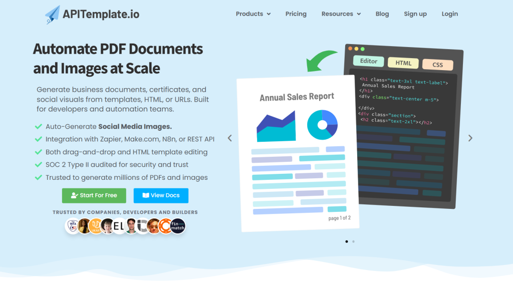
2. Generate Charts with APITemplate
APITemplate is a platform that allows you to generate social media images, banners, or PDFs from reusable templates with no coding required. It offers an easy-to-use drag-and-drop editor that doesn’t require any HTML or CSS knowledge.
Additionally, APITemplate supports dynamic components such as QR codes and ratings and has templates for Facebook posts, Instagram posts, Pinterest, and other social media platforms. Here are the benefits of using APITemplate:
- Generate images from reusable templates
- Integrate with Zapier, Airtable, Make.com, n8n, UiPath, or REST API
- Auto-position to create responsive images
- Smart crop to find a good crop for your image
- Add text to image or add a caption to images/photos via API
- Preview instantly
- No HTML or CSS knowledge required
2.1 Benefits of using ApexCharts With APITemplate
One of the benefits is that it can be used together with ApexCharts to generate vector-format charts. This is because ApexCharts can be embedded in HTML templates, which is the format that APITemplate uses. Using ApexCharts with it offers the following benefits:
i. Generate vector format charts:
Vector format charts offer several advantages over raster format charts. Vector format charts are resolution-independent, which means that they can be scaled up or down without losing quality. This is because vector charts are made up of mathematical equations rather than pixels.
As a result, vector charts can be resized to any size without becoming pixelated or blurry. This makes vector format charts ideal for creating high-quality charts for print or web use. With ApexCharts and APITemplate, you can generate vector format charts that are visually appealing and accurate.
ii. Easy integration with HTML templates:
APITemplate is a cloud-based platform that enables users to generate dynamic HTML templates with ease. HTML templates are used for creating dynamic web pages and can be easily integrated with other web technologies such as JavaScript, CSS, and APIs.
By combining ApexCharts with APITemplate, you can create custom HTML templates that include professional-looking charts. APITemplate offers a user-friendly interface that allows users to create HTML templates without any programming knowledge.
This makes it easy for users to create customized templates that suit their specific needs.
iii. Create professional-looking charts with ease:
Creating professional-looking charts can be a time-consuming and complex process. With both of them, you can create professional-looking charts with ease. ApexCharts offers a wide range of customization options, such as colors, fonts, sizes, and animations, that allow you to create charts that match your brand’s look and feel.
It offers pre-designed HTML templates that can be customized with ApexCharts to create visually appealing charts. This means that you don’t need to have design or programming skills to create professional-looking charts.
2.2 Steps to Generate PDF
Here are the steps to generate ApexCharts with APITemplate:
1. Go to the APITemplate.io website and create a new free account by clicking the sign-up button on the homepage.
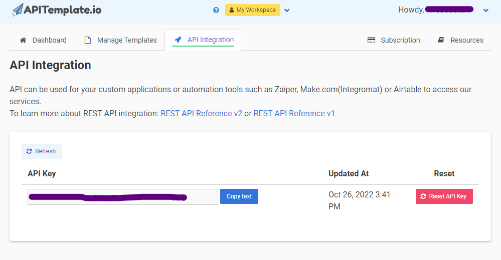
2. After signing up, you’ll be directed to your dashboard. Go to the API Integration tab from the navigation bar and copy the API Key, you can make API calls using this API keys.
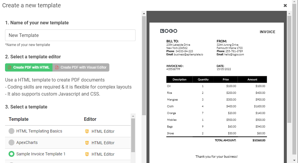
3. After that, Navigate to the Manage Template page and click on the Create PDF Template. It’ll prompt a list of pre-built PDF templates. Select “Sample Invoice Template 1” and click “Create”.
4. On the Manage Template page, click on the edit button on the right of the template that you just created. You’ll see the below HTML data:
<div class="main">
    <div class="header">
        <div class="parent2">
            <div class="frame-1">
                <h3>BILL TO:</h3>
                <p>
                    {{rece_addess1}}
                    <br> {{rece_addess2}}
                    <br> <b>Phone</b> : {{rece_phone}}
                    <br> <b>Email</b>: {{rece_email}}
                </p>
            </div>
            <div class="frame">
                <h3>FROM:</h3>
                <p>
                    {{sender_address1}}
                    <br> {{sender_address2}}
                    <br> <b>Phone</b>: {{sender_phone}}
                    <br> <b>Email</b>: {{sender_email}}
                </p>
            </div>
        </div>
        <div class="parent3">
            <div class="date">
                <p><b>INVOICE NO :</b><br> {{invoice_no}}</p>
            </div>
            <div class="date-1">
                <p><b>DATE:</b> <br> {{date}}</p>
            </div>
        </div>
    </div>
    <table>
        <thead>
            <tr>
                <th class="align-center">Description</th>
                <th class="align-center">Quantity</th>
                <th class="align-center">Price</th>
                <th class="align-center">Amount</th>
            </tr>
        </thead>
        <tbody>
            {%for item in items%}
            <tr>
                <td class="align-left">{{item.item_name}}</td>
                <td class="align-center">{{item.unit}}</td>
                <td class="align-right">{{ "$%.2f" | format(item.unit_price) }}</td>
                <td class="align-right">{{ "$%.2f" | format(item.unit_price * item.unit) }}</td>
            </tr>
            {%endfor%}
            <tr style="border-top: 4px solid black;">
                <td></td>
                <!-- <td></td> -->
                <td colspan="2" class="align-right"><strong>TOTAL AMOUNT:</strong></td>
                <td class="align-right"><strong>{{"$%.2f" | format(items | sum(attribute='total')) }}</strong></td>
            </tr>
        </tbody>
    </table>
    </div>
    <footer>
        Thank you for your business!
    </footer>
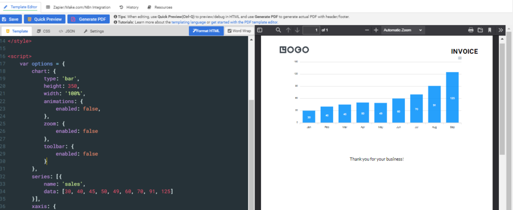
5. Now, let’s move on to adding the ApexCharts to our HTML template. To do this, we need to add the ApexCharts library to our HTML template. You can use the CDN link to add the ApexCharts library to your HTML template. Add the following script tag to your HTML template’s head section:
<script src="https://cdn.jsdelivr.net/npm/apexcharts"></script>
6. Now, let’s add the ApexCharts to the HTML template. We’ll create a div element to hold the chart and give it an ID so that we can reference it later. We’ll also add some CSS styles to give the chart a fixed height and width.
<div id="chart"></div>

<style>
    #chart {
        height: 400px;
        width: 100%;
    }
</style>
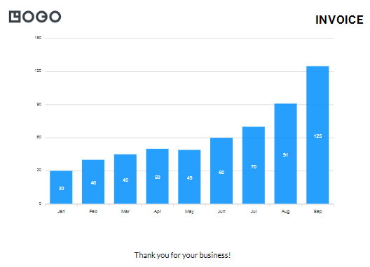
7. We can now create the chart using ApexCharts. First, we need to create a new ApexCharts object and pass in the chart options as a parameter. Here’s an example of the chart options we can use:
var options = {
    chart: {
        type: 'bar',
        height: 350,
        width: '100%',
        animations: {
            enabled: false,
        },
        zoom: {
            enabled: false
        }
    },
    series: [{
        name: 'sales',
        data: [30, 40, 45, 50, 49, 60, 70, 91, 125]
    }],
    xaxis: {
        categories: ['Jan', 'Feb', 'Mar', 'Apr', 'May', 'Jun', 'Jul', 'Aug', 'Sep']
    }
}

var chart = new ApexCharts(document.querySelector("#chart"), options);
chart.render();
In the options object, we’ve set the chart type to “bar”, the chart height to 350 pixels, and the chart width to 100%. We’ve also disabled the animations and zooming. We’ve defined the chart data as an array of sales values, and the x-axis categories as an array of month names.
Finally, we create a new ApexCharts object, passing in the div element where the chart should be rendered, as well as the options object we just defined. We then call the render() method to actually render the chart.
Below is the Complete HTML code after adding the Chart:
<div class="main">
    <div id="chart"></div>
</div>
<footer>
    Thank you for your business!
</footer>

<script src="https://cdn.jsdelivr.net/npm/apexcharts"></script>
<style>
    #chart {
        height: 400px;
        width: 100%;
    }
</style>

<script>
    var options = {
        chart: {
            type: 'bar',
            height: 350,
            width: '100%',
            animations: {
                enabled: false,
            },
            zoom: {
                enabled: false
            },
            toolbar: {
                    enabled: false
            }
        },
        series: [{
            name: 'sales',
            data: [30, 40, 45, 50, 49, 60, 70, 91, 125]
        }],
        xaxis: {
            categories: ['Jan', 'Feb', 'Mar', 'Apr', 'May', 'Jun', 'Jul', 'Aug', 'Sep']
        }
    }
    var chart = new ApexCharts(document.querySelector("#chart"), options);
    chart.render();
</script>
3. Using APITemplate’s API
Creating PDFs with ApexCharts using APITemplate’s API is a great way to generate visually appealing reports and data visualizations. To get started with this process, you can use the API to create dynamic content in your HTML code, which will be used to generate the PDF.
To use the API, first, you need to change the static content from the HTML to dynamic content. To do this, go to the JSON tab from the navigation bar on the top of the editing page and add your keys in JSON format as shown in the following example:
{
  "sales": {
    "data": [30,40,45,50,49,60,70,91,125],
    "categories": [1991,1992,1993,1994,1995,1996,1997,1998,1999]
  }
}
This JSON code defines the dynamic data that will be used to generate the PDF with ApexCharts.
Next, you need to modify the static HTML code to include the dynamic data. The modified HTML code is shown below:
<h1>This is bar chart demo<h1>
<div class="grid grid-cols-2 gap-1 ml-5 mr-5">
  <div class="m-2 p-2 border">
    <div id="barChart"></div>
  </div>
</div>

<script>
  new ApexCharts(document.querySelector("#barChart"), {
    chart: {
      type: 'bar',
      width: '100%',
      animations: {
        enabled: false,
      },
      toolbar: {
        show: false
      }
    },
    series: [{
      name: 'sales',
      data: {{sales.data | json}}
    }],
    xaxis: {
      categories: {{sales.categories | json}}
    },
    title: {
      text: 'Basic Bar Chart'
    },
  }).render();

</script>
In this modified HTML code, the dynamic data is referenced using the {{ }} notation(Jinja2). In the JavaScript code, the sales.data, and sales.categories variables are set to the inner text of the corresponding div elements. These variables are then used to generate the chart using ApexCharts.
The following is the CSS for the template:
<meta name="viewport" content="width=device-width, initial-scale=1">
<style>
  body {
    -webkit-font-smoothing: antialiased;
    background: white;
  }

</style>

<link href="https://cdnjs.cloudflare.com/ajax/libs/tailwindcss/2.0.3/tailwind.min.css" rel="stylesheet">
<script src="https://cdn.jsdelivr.net/npm/apexcharts"></script>
Once you have modified the HTML code, you can make API calls and send your data to the template to generate the PDF with ApexCharts.
In the following Python example, we make a POST request to the APITemplate API to create the PDF:
import requests, json

def main():
    api_key = "YOUR_API_KEY"
    template_id = "YOUR_TEMPLATE_ID"

    data = {
      "sales": {
      "data": [30,40,45,50,49,60,70,91,125],
      "categories": [1991,1992,1993,1994,1995,1996,1997,1998,1999]
     }
    }

    response = requests.post(
        F"https://rest.apitemplate.io/v2/create-pdf?template_id={template_id}",
        headers = {"X-API-KEY": F"{api_key}"},
        json= data
    )
    print(response)

if __name__ == "__main__":
    main()
4. Available Chart Types
One of the most important options in ApexCharts is the chart type. There are several different chart types you can choose from, each with its own unique look and feel. Here are some examples of different chart types and their corresponding code examples:
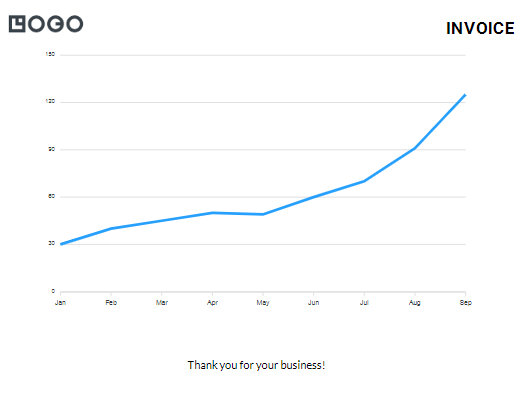
4.1 Line Charts
A line chart is a type of chart that displays data as a series of points connected by a line. This is useful for showing trends over time or for visualizing continuous data.
var options = {
  chart: {
    type: 'line',
        animations: {
        enabled: false,
    },
    zoom: {
        enabled: false
    },
    toolbar: {
            enabled: false
    }
  },
  series: [{
    name: 'sales',
    data: [30, 40, 45, 50, 49, 60, 70, 91, 125]
  }],
  xaxis: {
    categories: ['Jan', 'Feb', 'Mar', 'Apr', 'May', 'Jun', 'Jul', 'Aug', 'Sep']
  }
}

var chart = new ApexCharts(document.querySelector("#chart"), options);
chart.render();
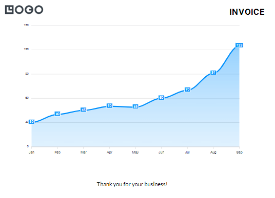
4.2 Area Charts
An area chart is a type of chart that is similar to a line chart, but with the area below the line filled in. This is useful for showing the extent of change over time or for highlighting the magnitude of a particular data point.
var options = {
  chart: {
    type: 'area',
        animations: {
        enabled: false,
    },
    zoom: {
        enabled: false
    },
    toolbar: {
            enabled: false
    }
  },
  series: [{
    name: 'sales',
    data: [30, 40, 45, 50, 49, 60, 70, 91, 125]
  }],
  xaxis: {
    categories: ['Jan', 'Feb', 'Mar', 'Apr', 'May', 'Jun', 'Jul', 'Aug', 'Sep']
  }
}

var chart = new ApexCharts(document.querySelector("#chart"), options);
chart.render();
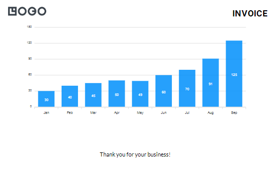
4.3 Bar Charts/Column Charts
A bar chart, also known as a column chart, is a type of chart that displays data as rectangular bars. This is useful for comparing data across categories or for showing the magnitude of different data points.
var options = {
  chart: {
    type: 'bar',
        animations: {
        enabled: false,
    },
    zoom: {
        enabled: false
    },
    toolbar: {
            enabled: false
    }
  },
  series: [{
    name: 'sales',
    data: [30, 40, 45, 50, 49, 60, 70, 91, 125]
  }],
  xaxis: {
    categories: ['Jan', 'Feb', 'Mar', 'Apr', 'May', 'Jun', 'Jul', 'Aug', 'Sep']
  }
}

var chart = new ApexCharts(document.querySelector("#chart"), options);
chart.render();
5. Customization Options
ApexCharts offers a variety of customization options to help you create beautiful and engaging charts. In this section, we’ll discuss some of the key customization options available in ApexCharts.
5.1 Colors
One of the easiest ways to customize an ApexChart is by changing the colors used in the chart. ApexCharts allows you to specify colors for various elements of the chart, including series, backgrounds, and axes.
Here’s an example of how you can customize the colors of a chart:
var options = {
  chart: {
    type: 'bar',
    height: 350,
    width: '100%',
    background: '#F2F2F2',
        animations: {
        enabled: false,
    },
    zoom: {
        enabled: false
    },
    toolbar: {
            enabled: false
    }
  },
  series: [{
    name: 'sales',
    data: [30, 40, 45, 50, 49, 60, 70, 91, 125],
    color: '#008FFB'
  }],
  xaxis: {
    categories: ['Jan', 'Feb', 'Mar', 'Apr', 'May', 'Jun', 'Jul', 'Aug', 'Sep'],
    labels: {
      style: {
        colors: ['#000000']
      }
    }
  }
}
In the example above, we’ve set the background color of the chart to “#F2F2F2”. We’ve also set the color of the series to “#008FFB”, and the color of the x-axis labels to “#000000”.
5.2 Fonts
ApexCharts also allows you to customize the fonts used in the chart. You can specify fonts for various elements of the chart, including titles, labels, and tooltips.
Here’s an example of how you can customize the fonts of a chart:
var options = {
  chart: {
    type: 'bar',
    height: 350,
    width: '100%',
    fontFamily: 'Helvetica, Arial, sans-serif',
        animations: {
        enabled: false,
    },
    zoom: {
        enabled: false
    },
    toolbar: {
            enabled: false
    }
  },
  series: [{
    name: 'sales',
    data: [30, 40, 45, 50, 49, 60, 70, 91, 125]
  }],
  xaxis: {
    categories: ['Jan', 'Feb', 'Mar', 'Apr', 'May', 'Jun', 'Jul', 'Aug', 'Sep'],
    labels: {
      style: {
        fontFamily: 'Helvetica, Arial, sans-serif'
      }
    }
  }
}
In the example above, we’ve set the font family of the chart to “Helvetica, Arial, sans-serif”. We’ve also set the font family of the x-axis labels to “Helvetica, Arial, sans-serif”.
5.3 Annotations and Markers
ApexCharts provides various types of annotations and markers to enhance the visual appeal of the chart. Annotations allow you to highlight specific points on the chart, while markers enable you to add specific shapes to data points.
Here’s an example of how to add annotations and markers to a line chart:
var options = {
  chart: {
    type: 'line',
    height: 350,
        animations: {
        enabled: false,
    },
    zoom: {
        enabled: false
    },
    toolbar: {
            enabled: false
    }
  },
  series: [{
    name: 'sales',
    data: [30, 40, 45, 50, 49, 60, 70, 91, 125]
  }],
  xaxis: {
    categories: ['Jan', 'Feb', 'Mar', 'Apr', 'May', 'Jun', 'Jul', 'Aug', 'Sep']
  },
  annotations: {
    points: [{
      x: 'Mar',
      y: 45,
      marker: {
        size: 8,
        fillColor: '#ffffff',
        strokeColor: '#00bfff',
        strokeWidth: 2,
        shape: 'circle'
      },
      label: {
        borderColor: '#00bfff',
        style: {
          color: '#00bfff',
          background: '#ffffff'
        },
        text: 'Annotation Text'
      }
    }]
  }
}

var chart = new ApexCharts(document.querySelector("#chart"), options);
chart.render();
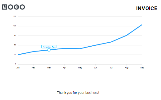
In this example, we’ve added a circular marker to the data point for March with the help of marker attribute. We have also added an annotation label to provide more information about that data point with the help of label attribute.
5.4 Legends and labels
ApexCharts provides you with the ability to customize the legends and labels in your charts. Legends provide a visual representation of the data series, while labels help identify specific data points.
Here’s an example of how to customize the legends and labels in a pie chart:
var options = {
  chart: {
    type: 'pie',
    height: 350,
        animations: {
        enabled: false,
    },
    zoom: {
        enabled: false
    },
    toolbar: {
            enabled: false
    }
  },
  series: [44, 55, 41, 17, 15],
  labels: ['Apple', 'Mango', 'Banana', 'Orange', 'Grapes'],
  legend: {
    position: 'bottom',
    horizontalAlign: 'center',
    show: true,
    fontSize: '14px',
    fontFamily: 'Helvetica, Arial',
    fontWeight: 400,
    markers: {
      width: 12,
      height: 12,
      strokeWidth: 0,
      offsetX: 0,
      offsetY: 0,
      radius: 0
    },
    itemMargin: {
      horizontal: 10,
      vertical: 5
    }
  }
}

var chart = new ApexCharts(document.querySelector("#chart"), options);
chart.render();
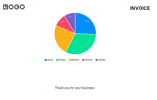
In this example, we’ve customized the legend’s position, horizontal alignment, font size, and font family with the help of legend attribute. We have also customized the markers and the item margin between each legend item. Additionally, we’ve customized the labels’ text and position with the help of labels attribute.
6. Conclusion
In conclusion, creating visually stunning charts for your PDF documents can be achieved with ease using ApexCharts and APITemplate. By following the steps outlined in this article, you can create professional-looking charts that effectively communicate your message.
Whether you are a marketer, a data analyst, or a business owner, these tools can help you create high-quality PDF documents that will impress your audience.
So why not give it a try and take your charts to the next level?
More Ways to Generate PDFs