Introduction
In this article, we’ll look at how we can make use of the Auto-Position feature in Image generation API. The idea is similar to web responsive design – to automatically position visual elements relative to each other.
With our Auto-Position, it’s easy to create visual elements in an image template that respond to the changes of other elements or the image canvas. In addition, an element can be configured to automatically match its dimensions to a target element.
Auto-position settings can be found in the property panel when an element is selected. The following is the auto-position section in the property panel.
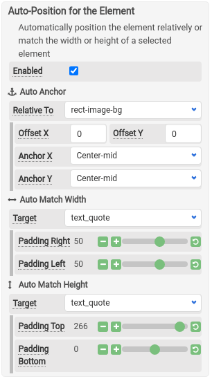
Auto Anchor
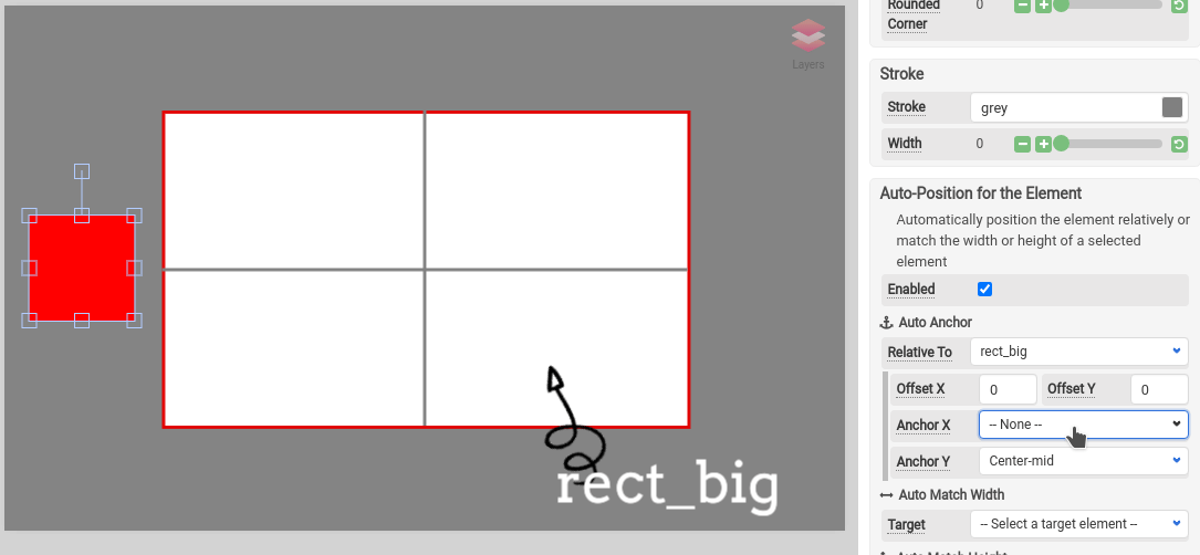
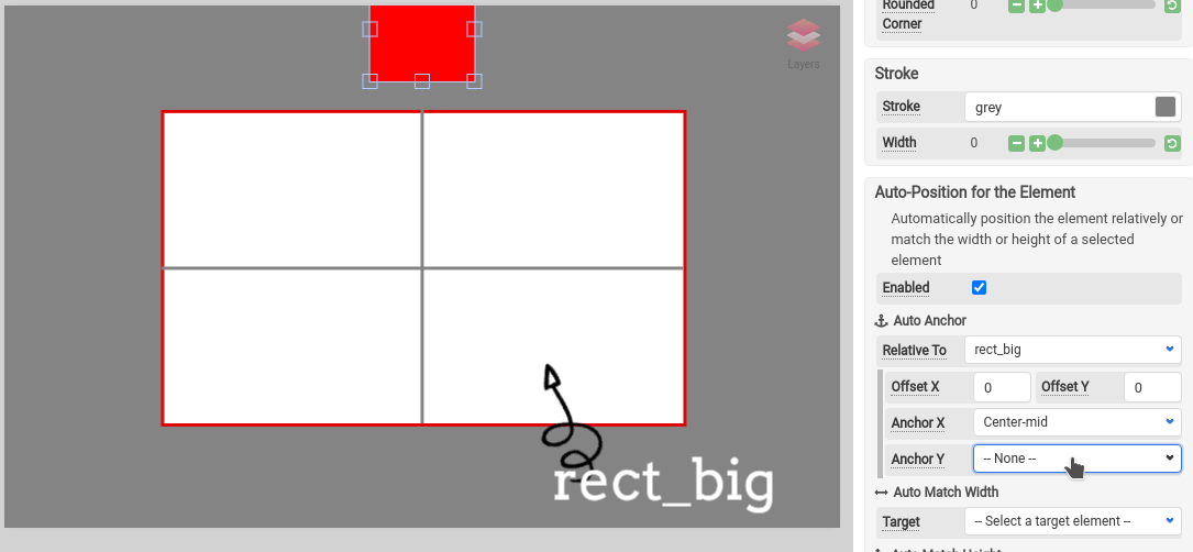
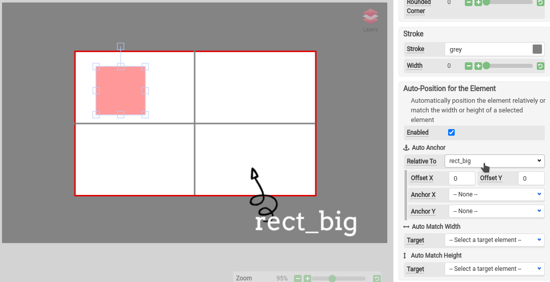
In the Auto-position section, check “Enabled” to enable the auto-positioning for the element. You have to specify the target element first then select either the types of anchors for Anchor X or Anchor Y. Optionally you can specify an offset X and offset Y.
Anchor X
Anchor the element horizontally relative to the target element.
There are 9 types of Anchor X: Left-outer, Left-mid, Left-inner, Center-left, Center-mid, Center-right, Right-inner, Right-mid and Right-outer.
Anchor Y
Anchor the element vertically relative to the target element.
There are 9 types of Anchor Y: Top-outer, Top-mid, Top-inner, Center-upper, Center-mid, Center-lower, Bottom-inner, Bottom-mid and Bottom-outer.
Auto Match Width and Height
With Auto Width or Height Match enabled, you can configure the element to automatically match the dimensions of a target element. Optionally, you can specify the additional padding in addition to the original width and height.
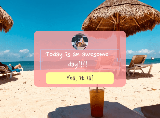
How to Create a responsive message box
In this section, we will explore the way to create a responsive message box. It can be quite useful when you have a dynamic text.
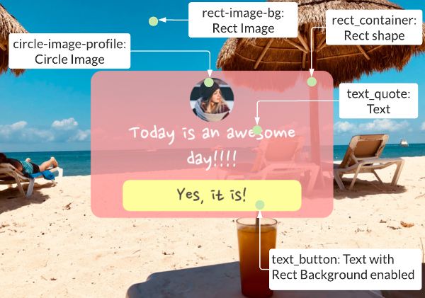
Whenever the dynamic text changes, the height of the text element also grows with it. Other elements configured with auto-position enabled also respond to the changes as well. The following is an example of a responsive layout for a quote.
Layers
The followings are the layers and names of all the visual elements.
Structure
All of the elements are interlocked, whenever one element changes another will respond to it.
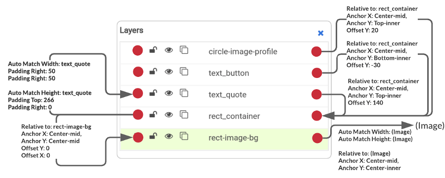
“rect-image-bg” is the background of the image, the height and width match to the dimensions of the image canvas
“rect_container” is the pink color rectangular background, its position is relative to the “rect-image-bg”. The dimensions of it automatically match the dimension of “text_quote”, whenever the text element resizes, the background dimension will change accordingly.
“text-quote” is the text element for quote/text, it’s relative to the “rect_container”. The offset Y is to 140px, which makes some space for the profile image(“circle-image-profile”)
“text_button” is at the bottom(inner) of the “rect_container” and the offset Y is set to -30.
“text_button” is at the top(inner) of the “rect_container” and the offset Y is set to 20.
Conclusion
Auto-Position feature is useful for dynamic text as well as for banners of different sizes. While the feature opens the possibility of creating dynamic content, but it also introduces complicity into the design.