Have you ever wondered why printer-friendly web pages are kind of a big deal? Well, it’s not just about making things easier for you – though that’s definitely a perk! Printer-friendly pages are all about improving your overall online experience. They help you conserve resources like paper and ink, ensuring you’re not unnecessarily wasting anything.
But it’s not just about being eco-friendly. Printer-friendly pages also make it super convenient for you to access content offline. Imagine being able to take your favorite articles or guides with you wherever you go, without needing an internet connection. Pretty neat, right?
And here’s the best part: printer-friendly pages show that websites care about their users. By offering print-friendly options, sites can build trust and credibility with you, showing that they value your preferences and needs.
So, how do they do it? Well, that’s where Cascading Style Sheets (CSS) come in. These handy tools give developers the power to customize how web pages look when you hit that print button. With CSS, they can tidy up the layout, hide any unnecessary clutter, and make sure everything prints out just right.
In this article, I will be showing you how to create printer-friendly with CSS, so you can enjoy a smoother online experience – all with a simple trick.
1. Basics of Print CSS
In CSS, media types allow you to specify different styles for different devices or situations. One of the most commonly used media types is the “print” media type, which is specifically designed for styling content when it’s printed onto paper.
When you create a website or web application, you typically design it with a specific layout, colors, and fonts that look great on a screen. However, when someone wants to print out your content, it may not look as good on paper as it does on the screen. That’s where the “print” media type comes in handy.
By using the “@media print” rule in your CSS, you can define styles that are specifically applied when the content is printed. This allows you to optimize the layout and appearance of your content for printing, ensuring that it looks professional and is easy to read on paper.
For example, you might want to:
i. Remove unnecessary elements: Hide navigation menus, sidebars, or other non-essential content that won’t be useful on a printed page.
ii. Adjust font sizes and colors: Increase the font size and use high-contrast colors to improve readability on paper.
iii. Control page breaks: Specify where page breaks should occur to ensure that content flows smoothly across multiple pages.
iv. Customize margins and padding: Adjust margins and padding to optimize the use of space on the printed page.
2. Creating a Print Stylesheet
Creating a print stylesheet in CSS is pretty easy. All you need to do is to create a stylesheet, define your print styles, and then link your print stylesheet. Here’s a detailed step-by-step guide on how to do this:
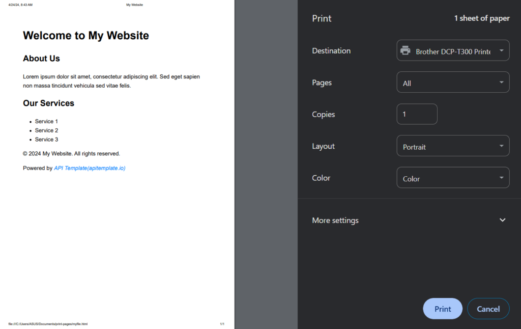
Step 1. Create your HTML file: Create a new HTML file called “myfile.html” and save.
Step 2. Create Your Print Stylesheet: Create a new CSS file named “print.css” and save it in the same directory as your HTML file.
Step 3. Link the Print Stylesheet: In the <head> section of your HTML document, add a <link> tag to link your print stylesheet. Set the rel attribute to “stylesheet” and the media attribute to “print”. The href attribute should point to the location of your “print.css” file
<!DOCTYPE html>
<html lang="en">
<head>
<meta charset="UTF-8">
<meta name="viewport" content="width=device-width, initial-scale=1.0">
<title>My Website</title>
<!-- Link to the print stylesheet -->
<link rel="stylesheet" media="print" href="print.css">
</head>
<body>
<header>
<h1>Welcome to My Website</h1>
<nav class="navigation">
<ul>
<li><a href="#">Home</a></li>
<li><a href="#">About</a></li>
<li><a href="#">Services</a></li>
<li><a href="#">Contact</a></li>
</ul>
</nav>
</header>
<main>
<section>
<h2>About Us</h2>
<p>Lorem ipsum dolor sit amet, consectetur adipiscing elit. Sed eget sapien non massa tincidunt vehicula sed vitae felis.</p>
</section>
<section>
<h2>Our Services</h2>
<ul>
<li>Service 1</li>
<li>Service 2</li>
<li>Service 3</li>
</ul>
</section>
</main>
<footer>
<p>© 2024 My Website. All rights reserved.</p>
<p>Powered by <a href="https://www.apitemplate.io">API Template(apitemplate.io)</a></p>
</footer>
</body>
</html>
Step 4. Define Print Styles: In your “print.css” file, define the styles you want to apply specifically for printing. This can include adjustments to font sizes, hiding unnecessary elements, and setting margins. Here’s an example:
@media print {
    /* print.css */

/* Set background color to white and text color to black for better print visibility */
body {
    background-color: white;
    color: black;
}

/* Adjust font size and style for improved readability */
body {
    font-size: 14pt; /* Increase font size for better legibility */
    font-family: Arial, sans-serif; /* Use a sans-serif font for easier reading */
    line-height: 1.6; /* Increase line height for better readability */
}

/* Hide navigation menu for cleaner print */
.navigation {
    display: none;
}

/* Add margin to the top and bottom of each printed page */
@page {
    margin: 20mm;
}

/* Highlight hyperlinks by underlining them */
a {
    text-decoration: underline; /* Underline hyperlinks for better visibility */
    color: #007bff; /* Blue color for hyperlinks */
}

/* Style hyperlinks to apitemplate.io */
a[href="https://www.apitemplate.io"] {
    font-style: italic; /* Italics for hyperlinks to apitemplate.io */
    color: #007bff; /* Blue color for hyperlinks */
    text-decoration: none; /* Remove underline for hyperlinks to apitemplate.io */
}

}
Step 5. Save Your Changes: Save both your HTML file and your “print.css” file after making any modifications.
Step 6. Test: Test your print styles by opening your HTML file in a web browser and selecting the option to print the page. Ensure that the printed output reflects the styles you defined in your “print.css” file, such as adjusted font sizes, hidden navigation menu, and margins.
3. Essential CSS for Printer-Friendly Pages
Creating printer-friendly web pages goes beyond just design. It’s about ensuring accessibility and usability for all users, whether they’re viewing content on a screen or in print. Cascading Style Sheets (CSS) play a crucial role in this endeavor, offering a range of tools and techniques to optimize web pages for printing. Here are some CSS essentials for printer-friendly pages:
i. Adjusting Colors and Backgrounds: It’s essential to consider how colors and backgrounds will appear when printed. Opt for a white background and black text for better visibility on paper. Remember, colors displayed on screen may differ when printed, so opt for high-contrast colors to enhance legibility. Consider converting colored text to black to conserve printer ink and improve readability.
ii. Optimizing Fonts and Text: Choose fonts and text sizes carefully to ensure readability, especially for users with visual impairments. Avoid excessively small text and ensure sufficient contrast between text and background colors for clarity.
iii. Hiding Non-Essential Elements: You can use CSS to hide elements that are unnecessary for print, such as navigation bars and ads, using the display: none; property. Simplifying the layout of printed pages helps focus on the core content without distractions.
iv. Simplify Layouts: Keep printed layouts simpler than their on-screen counterparts by hiding non-essential elements like navigation menus, footers, ads, and interactive elements such as buttons or sliders. This streamlines the printing process and enhances readability.
v. Link Information: Since URLs on printed pages aren’t clickable, consider displaying the actual URL alongside hyperlinks in the text. Alternatively, provide a list of URLs in a “References” section at the end of the document for easy reference.
vi. Compatibility: Ensure that your print CSS is compatible across different browsers and devices to guarantee a consistent printing experience for users. Test your print styles thoroughly to identify and resolve any compatibility issues.
vii. Testing: Always test your print styles by printing on paper or using print preview in various browsers. Different browsers may render print styles differently, so it’s crucial to check each major browser to ensure optimal printing results.
Implementing these CSS techniques can help you create printer-friendly web pages that prioritize accessibility and readability.
4. Advanced Techniques for Printer-Friendly Pages
While the above-discussed techniques form the basis of creating print-friendly pages, there are advanced CSS techniques that can further enhance the printability of your web pages. These include specifying page breaks, adjusting image sizes, and formatting tables for print, among others. In this section, we will look at some of the advanced techniques used for creating the most efficient print-friendly pages.
4.1 – Handling Images
When optimizing pages for print, it’s important to consider the presentation of images on your page. Here are some techniques you may want to consider:
i. Sizing Images: It’s important to resize images appropriately for print to ensure they fit well on the page without dominating the layout. To resize images, you can use CSS to set max-width and max-height properties to control image dimensions.
ii. Deciding When to Hide Images: You can also evaluate the relevance of images in a printed context. Try to consider hiding decorative or non-essential images using CSS display properties (display: none;) to organize the print layout and conserve paper and ink.
4.2 – Page Breaks
Controlling pagination is essential for maintaining the readability of printed content. CSS provides several properties to manage page breaks:
i. page-break-before: This property allows you to specify whether a page break should occur before an element. For example, you can use page-break-before: always; to force a page break before a specific element, ensuring it starts on a new page.
/* Force a page break before printing a specific element */
.print-break-before {
    page-break-before: always;
}
Here are other values you can use with the page-break-before property:
auto: Default value. Page breaks are determined by browser settings.avoid: Avoids a page break before the element.left: Forces a page break before the element, causing the next page to start on the left side.right: Forces a page break before the element, causing the next page to start on the right side.
ii. page-break-after: Similar to page-break-before, page-break-after allows you to control pagination by specifying whether a page break should occur after an element. You can also use page-break-after: always; to ensure that content after the element starts on a new page
/* Force a page break after printing a specific element */
.print-break-after {
    page-break-after: always;
}
Here are other values you can use with the page-break-after property:
auto: Default value. Page breaks are determined by browser settings.avoid: Avoids a page break after the element.left: Forces a page break after the element, causing the next page to start on the left side.right: Forces a page break after the element, causing the next page to start on the right side.
iii. page-break-inside: This property allows you to control pagination within an element, such as a container with multiple child elements. By setting page-break-inside: avoid;, you can prevent the element from being split across multiple pages, ensuring that it stays intact on a single page.
/* Avoid page breaks inside a specific element */
.print-no-break-inside {
    page-break-inside: avoid;
}
Here are other values you can use with the page-break-inside property:
auto: Default value. Page breaks are determined by browser settings.left: Forces a page break after the element, causing the next page to start on the left side.right: Forces a page break after the element, causing the next page to start on the right side.
4.3 – Customizing Tables for Print
Tables often present a challenge when printing due to their potential to span multiple pages or become difficult to read in a printed format. Here’s how to optimize tables for print:
- Adjusting Table Layouts: Use CSS to modify table layouts for print by adjusting column widths, cell padding, and borders. This simplifies complex tables by removing unnecessary columns or rows to ensure readability in a printed format.
- Transforming Data-Heavy Tables: For tables with extensive data, consider transforming them into simpler formats, such as lists or summarized versions, to avoid overwhelming the reader.
4.4 – Managing Text Overflow
Text overflow can occur when content exceeds the boundaries of the printed page, leading to truncated text or awkward line breaks. Here’s how to address it:
Using the CSS Overflow Property: Use the CSS overflow property to specify how text should behave when it overflows its container. Options include:
- overflow: auto; This allows you to add scrollbars
- overflow: hidden; This allows you hide overflow content
- overflow: visible; This allows overflow content to be visible.
5. Responsive printing
CSS media queries are a powerful tool that allows your website adapt its appearance on any device. It is used to apply different styles to a webpage based on various factors such as screen height size, device orientation, and more.
Media queries follow a simple syntax using the @media rule, where you specify the type of device or media you’re targeting, along with conditions for applying styles. The syntax typically looks like this:
@media media_type and (media_feature) {
    /* CSS rules */
}
There are also media types. Media types specify the type of device or media the styles are intended for. Common media types include:
- all: Applies to all devices and media types.
- screen: Applies to screens (desktops, laptops, tablets, smartphones).
- print: Applies when printing the document.
- speech: Applies to screen readers and other speech synthesizers.
Our focus here is on the print media type.
CSS media queries for print allow you to apply different styles based on paper size or orientation when printing. Here’s how you can use media queries to target specific print conditions:
/* Default styles for printed content */
@media print {
    /* Styles common to all printed content */
    body {
        font-family: Arial, sans-serif;
        font-size: 12pt;
    }

    /* Styles for landscape orientation */
    @page {
        size: landscape;
    }

    /* Styles for specific paper sizes */
    @page {
        size: A4; /* Set paper size to A4 */
    }

    /* Styles for specific paper sizes with custom dimensions */
    @page {
        size: 8.5in 11in; /* Set paper size to 8.5 inches by 11 inches */
    }
}
The @media print rule applies styles specifically for printed content. You can adjust these styles and media queries according to your specific requirements, such as targeting different paper sizes or orientations to optimize the printed output for various printing scenarios.
6. Test and Tweak!
Testing printed output and organizing CSS styles are essential steps to ensure that your website’s content looks its best when printed. Here’s why it’s crucial:
- User Experience Matters: Just like how you carefully create the online experience for your users, it’s equally important to ensure a smooth experience when they print your content. Testing ensures that users can access your content in the format they prefer, whether it’s on screen or on paper.
- Visual Consistency: What looks great on a screen might not translate well to print. Testing allows you to verify that your fonts, colors, and layouts maintain their integrity in the printed format, ensuring visual consistency across different mediums.
- Optimizing for Resources: Printing content consumes resources like ink and paper. By fine-tuning your CSS for print, you can minimize ink usage, reduce paper waste, and ultimately save costs for both your users and the environment.
- Professionalism and Branding: Your printed output is a reflection of your brand’s professionalism and attention to detail. By testing and refining your print styles, you can ensure that your printed materials uphold your brand’s image and leave a positive impression on your audience.
7. Tools and Resources
To help you create printer-friendly pages with CSS, there are various tools and resources available. Some helpful ones include:
Browser developer tools
Browser developer tools like the print preview feature or Google Chrome Dev tools are available for developers who want to inspect the pages of a website. Here’s how to do this:
7.1 – Browser Print Preview
Below are the steps on how to use a browser’s print view:
- Access Print Preview: Open the webpage you want to print in your web browser (e.g., Google Chrome).
- Open Print Dialog: Navigate to the print menu by either pressing Ctrl + P (Cmd + P on Mac) or selecting “Print” from the browser’s menu.
- Preview Print Styles: In the print dialog, look for an option to preview the print layout or styles. Most browsers offer a “Print Preview” button that allows you to see how the webpage will look when printed.
- Adjust Print Settings: Use the print preview to inspect the layout, fonts, and other styles. You can adjust settings such as margins, headers, footers, and page orientation to ensure the printed output meets your expectations.
- Test Printing: After making adjustments, you can print a test page to see how the content appears on paper. This allows you to identify any issues and iterate on your print styles as needed.
7.2 – Chrome DevTools
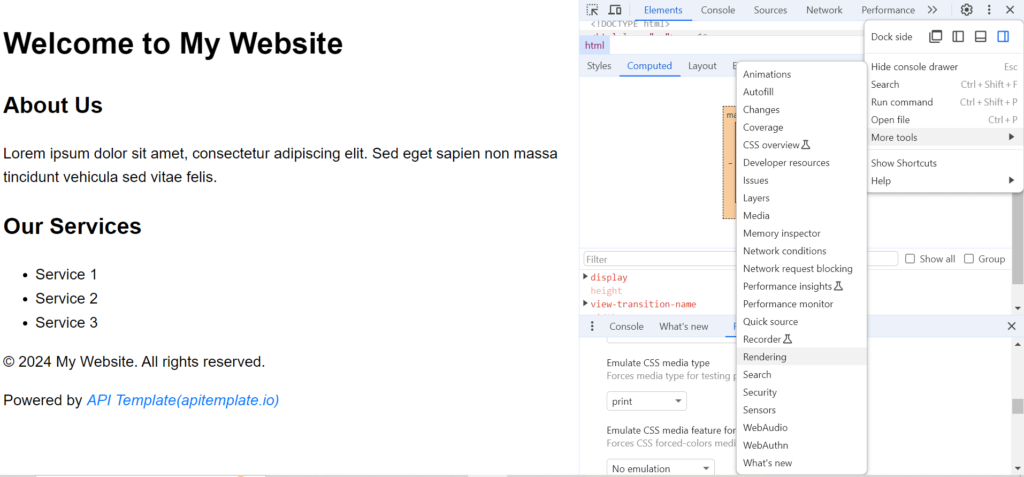
To use Chrome Devtools, here are the steps:
- Open DevTools: Open the webpage you want to inspect in Google Chrome. Right-click on any element on the page and select “Inspect” from the context menu, or press Ctrl + Shift + I (Cmd + Option + I on Mac) to open Chrome DevTools.
- Navigate to Elements Panel: In Chrome DevTools, navigate to the three dot icons on the top right, then select more tools, and then rendering. Scroll to the bottom and change Emulate CSS Media type to print. This displays the print structure of the webpage
Bootstrap also provides built-in support for print styles, making it easy to create printer-friendly layouts. Additionally, Tailwind CSS offers customizable utility classes for creating custom print stylesheets. Semantic UI also includes print-specific classes and utilities for easy customization of print styles.
8. Conclusion
Creating printer-friendly web pages is crucial for maintaining accessibility and enhancing user experience. Always remember that user experience matters, and what looks great on a screen might not translate well to print. Testing and tweaking are essential to ensure visual consistency across different mediums.
Creating printer-friendly designs isn’t just about improving user experience – it’s also about being mindful of our environment. By fine-tuning your CSS for print, you can minimize ink usage, reduce paper waste, and contribute to a more sustainable world.
Apitemplate.io supports HTML to PDF conversion and PDF generation API that allows you easily create and download PDF documents. It supports programming languages like PHP, Python, Java, and more. For more information, check out our blog.