Auto-Position: Create Responsive Image Templates
Auto-Position lets you build image templates where elements automatically reposition and resize relative to each other — similar to responsive web design. This is especially useful when working with dynamic text that can vary in length.
This guide is based on the full tutorial: Create a Responsive Image Template using Auto-Position.
Overview
With Auto-Position you can:
- Anchor elements horizontally or vertically relative to another element
- Auto-match an element's width or height to a target element
- Build layouts that adapt automatically when content changes (e.g. longer text, different image sizes)
Enabling Auto-Position
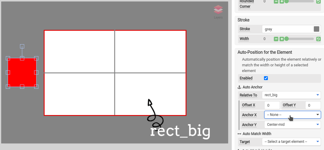
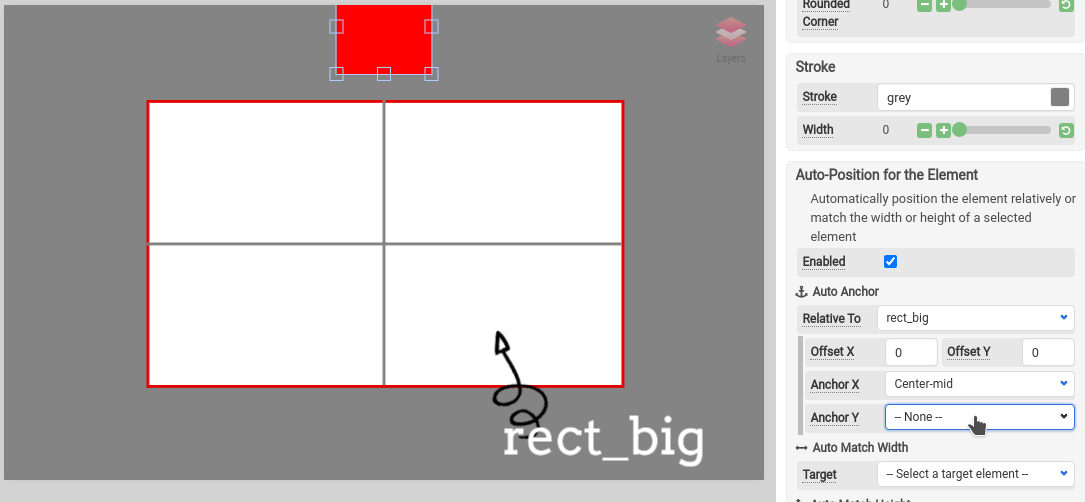
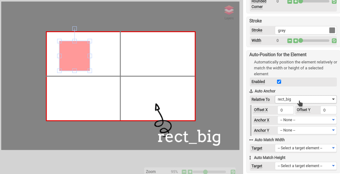
Select an element in the Image Template Editor, then open the Auto-position section in the property panel.
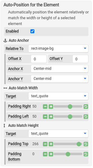
- Check Enabled to turn on auto-positioning
- Choose a target element — the element this one positions itself relative to
- Set Anchor X and/or Anchor Y to control the positioning
- Optionally set Offset X and Offset Y for fine-tuning
Anchor X
Anchor X controls horizontal positioning relative to the target element.
There are 9 types of Anchor X:
| Anchor | Description |
|---|---|
| Left-outer | Outside the target's left edge |
| Left-mid | Centered on the target's left edge |
| Left-inner | Inside the target's left edge |
| Center-left | Between the target's left edge and center |
| Center-mid | Centered horizontally on the target |
| Center-right | Between the target's center and right edge |
| Right-inner | Inside the target's right edge |
| Right-mid | Centered on the target's right edge |
| Right-outer | Outside the target's right edge |
Anchor Y
Anchor Y controls vertical positioning relative to the target element.
There are 9 types of Anchor Y:
| Anchor | Description |
|---|---|
| Top-outer | Above the target's top edge |
| Top-mid | Centered on the target's top edge |
| Top-inner | Inside the target's top edge |
| Center-upper | Between the target's top edge and center |
| Center-mid | Centered vertically on the target |
| Center-lower | Between the target's center and bottom edge |
| Bottom-inner | Inside the target's bottom edge |
| Bottom-mid | Centered on the target's bottom edge |
| Bottom-outer | Below the target's bottom edge |
Auto Match Width and Height
With Auto Width or Height Match enabled, an element automatically matches the dimensions of a target element. You can add extra padding on top of the matched width/height.
This is useful for backgrounds that need to grow or shrink to fit their content.
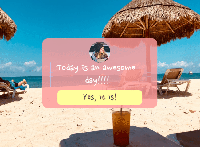
Example: Responsive message box
Here's a practical example — a quote card where the background and layout adjust automatically when the text changes.
Layer structure
The template uses these layers:
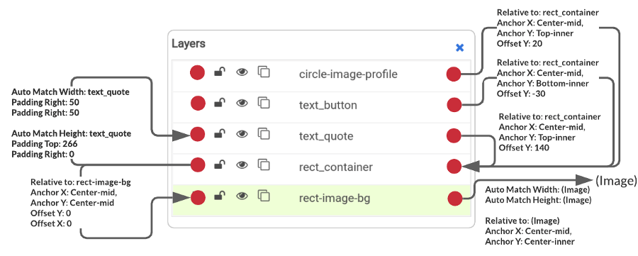
How the elements connect
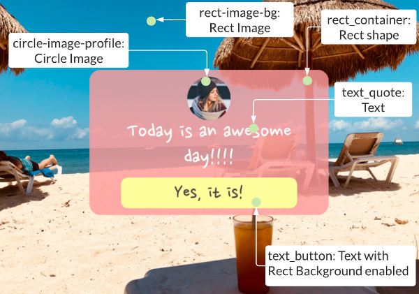
All elements are interlocked so that when one changes, the others respond:
| Element | Role | Positioning |
|---|---|---|
rect-image-bg | Full image background | Width and height match the canvas dimensions |
rect_container | Pink background box | Positioned relative to rect-image-bg; dimensions auto-match text_quote |
text-quote | Quote / body text | Positioned relative to rect_container with Offset Y of 140px (space for the profile image) |
text_button | Button at the bottom | Bottom-inner of rect_container with Offset Y of -30 |
circle-image-profile | Profile image | Top-inner of rect_container with Offset Y of 20 |
When the quote text grows, text-quote gets taller, which causes rect_container to resize (via auto-match), which pushes text_button down automatically.
Tips
- Start simple — anchor one element at a time and preview the result before adding more
- Use Offset X/Y to add breathing room between elements
- Auto-Position works well with Direct URL generation for fully dynamic images
- Test with both short and long text to make sure your layout handles edge cases